Sunday, February 27, 2011

Albright Knox

Which artworks make an impact or impression on me?
1. Jackson Pollack
Convergence, 1952. Oil on canvas. 95 1/4 x 157 1/8 inches

I was drawn to this work first by its scale. It dares you to look closer. The limited color palette makes the yellow, orange and blue stand out. It is well balanced and I was fascinated by its complexity.


2. Jim Hodges
Look and See, 2005. Enamel on stainless steel. 300 x 138 x 144 inches


This piece just seems so effortlessly graceful. It has this natural movement because of its shape and its reflective surface. Its use of space makes it hard to decipher where the work stops and its environment begins.


3. Norman Lewis
Street Music, 1950. Oil on canvas.

This is much smaller compared to the other two works. However, it made a strong impression on me. At first glance, the work just seems to be scribbles of simple shapes and lines. However, once I looked more closely the shapes and lines formed into people and music notes and instruments. It suddenly became a scene filled with life and energy.


Which artworks do I feel a connection with?
1. Sonja Brass
The Quiet Dissolution, Firestorm. 2008. Color print. Edition 8/8

I felt a connection with this artwork because I was immediately reminded of flying over a city a night. I flown into New York City, Buffalo and Las Vegas at night and the lights are breath-taking. This print has such a balance because of the fiery horizon that divides light of the city and the sky.


2. Paul Pfeiffer
Caryatid (Red, Yellow, Blue), 2008. Three-channel video and three monitors, 32 x 21 x 25 inches
I made a connection with this work because I love sports. The way Pfeiffer synchronized the three monitors and edited out the other players makes the players look like choreographed dancers.


3. Paul Pfeiffer
Caryatid, 2004. DVD with chromed mirror.
I connected with this piece also because of my love of sports, especially hockey. The Stanley Cup represents a life's dream for players and it gives so much pride for the team's city. Deleting the players that hold the trophy emphasizes this. It shows how much our culture glorifies sports. The chrome television also mimics the the finish of the Stanley Cup.


Which artworks would I like to know more about?
 1. Zhan Wang
Urban Landscape Buffalo, 2005–10. Stainless steel pots, pans, and kitchen utensils.
I want to know what inspired this work and the creative process. Why the choice to use kitchen wear and not just choose to make the forms? I also want to know how many individual pieces comprise the work? It's like looking at a model and it makes me wish I could walk around inside and look at everything more closely.


2.Marisol
Baby Girl, 1963. Wood and mixed media. Overall 74 x 35 x 47 inches


Th scale of this work and the use of various media just makes me want to know how she came up with this concept. There tremendous detail of the faces and bow. This makes me wonder why she chose to carve the base from wood and not just do a drawing?


3. Laurie Simmons
Magnum Opus II (the Bye-Bye), 1991. Gelatin Silver Print, edition 1/5. 54 x 95 in
The figures used in the print are just so bizarre in nature that it begs the question "why?"

Saturday, February 26, 2011


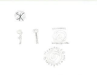
I thought creating a logo for myself was a great way to understand the learning material. The most important discovery I made creating my logo was that it was harder than I thought it would be to come up with a concept. My first thought was creating something around a volleyball because I have been playing volleyball since 8th grade and most people know that the sport is very important to me. Then I decided I wanted to do something less obvious. I thought about my other qualities. Humans  in general are complex creatures with many layers. I thought of a flower and how the petals layer and overlap and blossom. I decided on a rose because it is an iconic image of romance and I am romantic person. However, I also like the rose because it is also tough with its thorns. I thought it was a deeper representation of myself.

The videos and other material were really helpful. It really took you through the steps and process. The most important thing I learned came from the video Graphic Design. It helped me realize that I should not be discouraged when it takes time to come up with the right concept. In the video they began with a image inspired by a firework and turned that into a design of  concentric circles, which was far from where they started.

Photobucket


Photobucket

Saturday, February 19, 2011

Value and Color

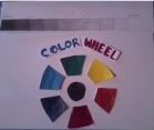
I really enjoyed creating the value scale and color wheel. It was different art creation experience because it was more hands-on but it was also relatively simple so it made it fun to do. I enjoyed working with the acrylic paints more than the pencil I used to create the value scale. It reminded me of my art classes in when I was younger. After I was done making the color wheel, I found myself mixing the colors more and just making brush strokes to play with the paint.

The most important discovery from the creation of these studies was also the most important thing I learned from the videos, this being that the true primary colors are magenta, cyan and yellow. After I learned this, I thought of the colors from a color ink cartridge. The colors in it are not red, yellow and blue but magenta, cyan and yellow.


Photobucket

Saturday, February 12, 2011

Photography

I began this project by looking around my home and finding objects that struck my attention. For instance, the picture of four circles came from a pillow in my home. When it caught my eye, I thought about why this object made me look at it rather than just glance over it. I realized it was the circles juxtaposes the square pillow, combined with the inverse colors that made me pay attention. I used this process for most of the other photos. When I say my piano, I immediately saw lines. When I saw the leaf with sunlight beaming through, I just wanted to touch it to feel the texture. I found my myself looking at things and connecting them to the elements and principles.

Then I began looking outside and as I walked around I began to notice things. The streetlight that was at an angle but somehow is still in proportion with the tree to left and right. Which I captured by using the black and white effect on my camera. Looking at the dead end sign at the end of my street I kept seeing a "V" form. The snow mounds and then the sign itself and then the branches of the trees.

This project made me stop and think about why a simple object catches my eye or just looks beautiful. My favorite photograph is the icicle picture. It is the harmony of it that compelled me to capture it.

See the slideshow here:

http://s1189.photobucket.com/albums/z430/vball1220/?albumview=slideshow

Friday, February 11, 2011

Color and Emotion

Color can only occur because of light. Light allows for the reflection of color. There are three physical properties of color. Hue describes the specific wavelength of light that allows us to recognize a specific color. The intensity of color refers to the strength of the color, simply meaning the brightness or dullness of the color. Value is the lightness or darkness of the color. Mixing black will lower the value, while mixing white will raise the value. This will also effect the hue and intensity of the color.

Color can invoke and often represent emotions. Warm colors like red, orange and yellow make one think of fire, passion, love or anger. Cool colors like blue, purple and green can represent sadness and isolation.

The theory of color is fascinating. Color is dependent on light. We can see light but cannot touch it. Yet, it is what makes it possible for us to touch a physical object and see its color.

In the video Color, I was most intrigued by the making of lapis lazuli. extracting its pigment allowed for the creation of the most intense blue possible. By using it artists could create a stronger image.

In the video Feelings: Emotion and Art, I was intrigued by the explanation of the Oath of the Horatti, it brought to my attention the contrast of dark and light and how each of the three pillars frame each of the three groups of people. I had not realized this before.

Friday, February 4, 2011

Aesthetics Videos

Aesthetics: The Philosophy of Arts Video Concepts
The video discusses the various theories of aesthetics and how philosophers have tried to define the term for many centuries.
-Plato-one of the most important contributors to aesthetic theory. I also believe his theory to be the most important.  He argued that what attracted people to an object was what they were personally believed was most beautiful. It is an "erotic attraction." I believe this is most important because it provides the basis for evaluation of art and why the same artwork can be interpreted differently.
- Aristotle was Plato's student. He believed that art is imitation.
- Alexander Baumgarten was also important because he introduced the term aesthetic and helped define it.
-Immanuel Kant argued that it is our judgement that allows us to evaluate and experience beauty. 
CARTA: Neurobiology Neurology and Art and Aesthetics Concepts
Changeux
-The evolution of man meant larger brain capacity. This allowed for the discovery of tools, symmetry, symbolism, artistic composition. Also, evolution afforded man to create more advanced techniques through more complex thought processes
- Art: uses symbolic forms to communicate non-verbally in order to convey emotions
- Aesthetic efficacy is the access to consciousness
- Art is constantly changing and evolving
- Bottom-up processing of visual image to generate emotional response
- There is difference in conscious and non-conscious processing of art
- Rules for processing art:
Novelty: constant search of unanticipated
Concensus partium: universal search for harmony
Schematisation: top down abstraction vs bottom down realism
Artist conception of the world is important. It is a function of art to make us aware

Ramachandran
-The goal of art is to deliberately exaggerate and distort image to create pleasing affects in brain-(hyper stimulation)
- Aesthetics is what happens before object recognition
- Argues that there are artistic universals (laws of aesthetics)
-Brain’s response to art
1.       Grouping or binding-problem solving-brains circuitry-similar colors to be pleasing to eye
2.       Peak shift principles-amplify features
3.       Symmetry
4.       Isolation-focus on the critical and outline
5.       Perceptual problem solving
6.       Suspicious consequences
7.       Art as metaphor
8.       Contrast
Changeux and Ramachandran's conclusions of aesthetics make a lot of sense. Changeux approached the topic from more of a evolutionary standpoint by arguing that the increase in brain size allowed for the development of complex thought, which in turn allows for simultaneous conscious and  non-conscious evaluation. Ramachandran attempted to explain what it is specifically about a piece of art stimulates the brain into telling us it is beautiful. The pictures he showed as evidence really enhanced his ideas. The most interesting fact I learned came from Changeux and his evidence that the brain reacts non-consciously to a hidden image without us realizing. 
Both films were very interesting to watch. Watching them definitely enhanced my understanding of aesthetics, one on a philosophical level and the other on a realistic level. The videos expanded on the text. The CARTA video took the idea of what makes art aesthetically pleasing beyond the tools artists use.